When you are thinking about having a logo designed, you will probably have some ideas in your head of how you want it to look. Perhaps it will incorporate the name of your business in some way, or maybe there will be a company colour (or colours) that you will want to implement into the design?
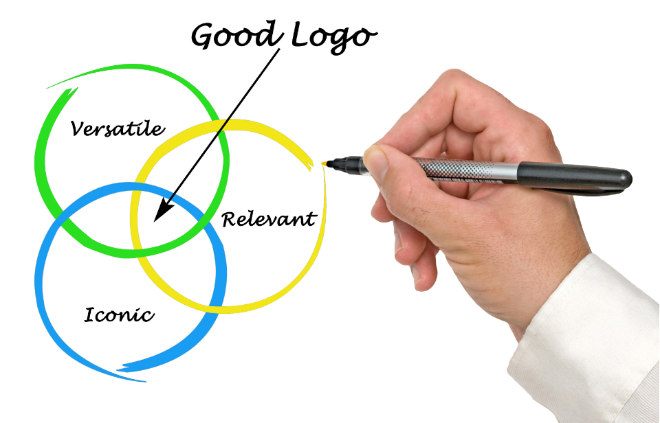
Logos can and should look great, as they allow customers to identify you and your brand with a single image. Yet, what people can tend to overlook is that your logo must work in different ways at different times – it is not a one-size-fits-all entity.
For example, you may have a large and intricate logo that looks great and takes pride of place at the top of your website and is made with great attention to detail and design. While this works well for your website, you will find that scaling down this graphic to fit on your business cards or products means that you have to obviously reduce it in size. With this then, you are losing the quality of the initial big and impactful logo that you have and parts of it may also become illegible or difficult to read and understand.
In instances like this, the image that consumers and potential consumers are accustomed to seeing from your marketing efforts may look quite different when they come face-to-face with your product. Can you really afford to have them interact with your product but do not go through to purchase it as they are unsure if it is from the company they saw advertising it? They should instantly be able to make the connection, and your logo visibility and clarity play a big part in that.
It would be recommended that a company use a single logo that can come to represent them; therefore, it is not advised to have one logo on your website and another on your products and another variation for leaflets etc. Of course, larger corporations may have multiple logos for their multitude of sections, sectors and products; but for most businesses, a single logo is used as their unique signifier. If we take Apple as an example, their simple apple motif easily lets consumers know that they are interacting with Apple as the logo works seamlessly with their products, shopfronts and advertising campaigns.
So when thinking about and eventually relaying ideas for the design of your logo to your chosen logo design, have a think as to where it will be used across your business: Website Social Media Icons (Facebook, Twitter etc.), Business Cards, Headed Paper Products, Brochures and Leaflets Newsletters Flyers Branded Stationary… the list goes on.
At Ireland Website Design, our logo designers consider all of the above scenarios and more to ensure that your logo is the best that it can be wherever you may use it.
Ireland Website Design has a team of expert logo designers and branding specialists who understand what your logo needs to do for you and works with you to get it exactly how you would like it to look when used in more than one place within your business. From colour, picture, text and size options and more, our team have created a plethora of logos over the years that still remain in use today. While we obviously work to what the client has in mind, we want to be sure that your logo is a fresh and sick design that also has a timeless appeal that will not look dated in years to come wherever it is seen.,


