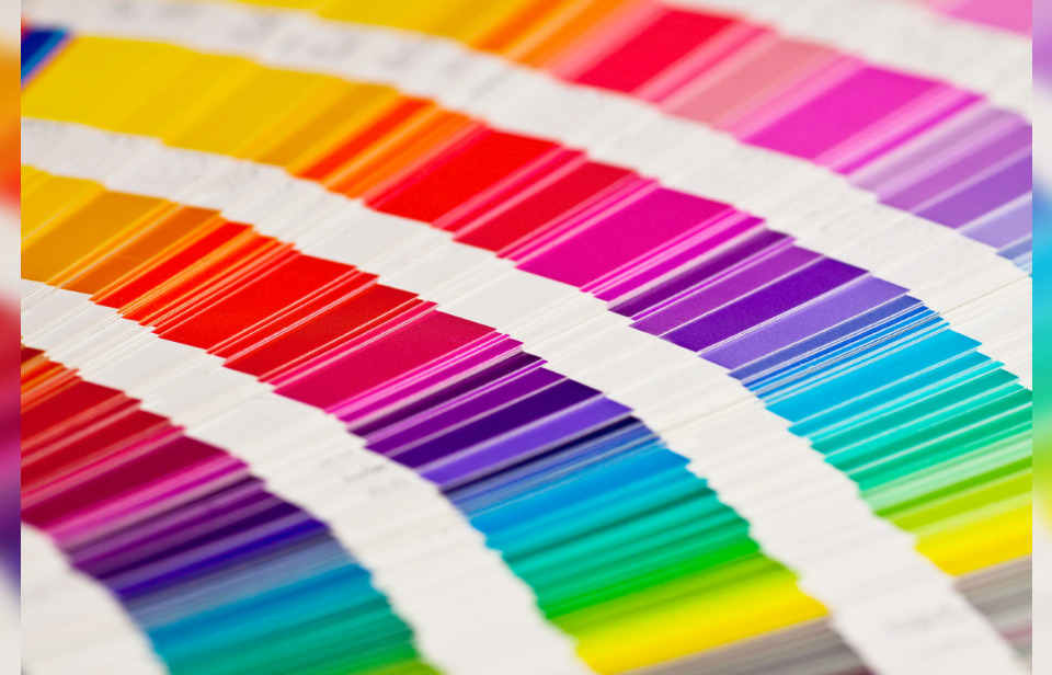
When designing your logo, colours are one of the most important aspects of the design.
As expert logo designers, we’ve got years of experience helping clients encapsulate their company’s mission, services, and values into their logo. Sometimes logos just need small tweaks to stay connected with modern design trends. Sometimes they need to go back to the drawing board entirely.
With logo design, colours are incredibly important.
Colours carry psychological meaning and knowing the psychology behind each colour can really help you determine what colour best suits your logo and your company. As professional logo designers, we’ve studied and understood the importance of different colours and their effect on customers.
Some businesses work well with certain colours and others not so much. If you want to be easily remembered by your audience then it’s all about knowing what colour will work for your business.
For example, businesses related to the sea or the ocean often have blue logos, holiday and travel businesses use a lot of yellow in their logos, and environmental websites use green and brown.
So what colour should you choose?
To help you figure out what colour is right for you, we’ve put together this blog. We’re going to reveal the psychology behind some of the most popular colour choices in logo design.
Why are colours important for your logo design?
Colours are an incredibly important part of your logo design and colours alone can actually influence up to 90% of a customers’ initial impression of your business.
It also influences 90% of a customers’s when it comes to purchasing decisions. Meaning if your logo doesn’t quite suit your audience’s expectations they might not even buy from you.
Colour choice also helps a lot with brand awareness. Most people will remember a brand’s colour before they remember its name. The colour you choose for your company can increase your brand awareness by 80% so it really is an important decision that shouldn’t be brushed off.
Don’t choose your colours at random, take your time and put actual thought into why you’re branding your company with these specific colours.
Yellow logo design
What’s the colour yellow associated with?
Yellow is a colour associated with:
- Warning
- Construction
- Taxis
- Sunshine
What feelings does the colour yellow invoke?
It invokes positive feelings like:
- High Energy
- Optimism
- Curiosity
- Warmth
- Happiness
- Enlightenment
- Creativity
It invokes negative feelings like:
- Dishonesty
- Youthfulness
- Immaturity
- Anger
- Frustration
- Cowardice
- Betrayal
- Egoism
Yellow is a colour that causes strong reactions in most people, but a good colour to use if you want to attract attention.
When done well, using yellow can work great in logo design. Use this colour cautiously though as too much yellow can lead to a loss of focus!
Yellow is used best in a supportive role to another colour like black or brown to support it.
- Pros: A warm and happy colour
- Cons: Bit tiring for the eyes and straining to look at if there’s too much of it
- Used by: Golden Pages, CAT, Shell, BP, McDonald’s, MasterCard, Amazon, Batman
- Works well with: Black, Brown, Green
Green logo design


Green is associated with:
- Ireland
- Nature
- The environment
- Recycling
- Fruits
- Vegetables
- Gardening
- Health & wellness
- Finance & money
- Fertility
- Growth
- Construction
Green is the colour of nature and is naturally pleasing to the eye. Green is also definitely our favourite colour (you could probably guess that from our website though).
Green can make your audience feel like your company is environmentally friendly because of the association to nature.
What feelings does the colour green invoke?
It invokes positive feelings like:
- Serenity
- Peace
- Joy
- Hope
- Success
It invokes negative feelings like:
- Jealousy
- Greed
- Materialism
- Self-indulgence.
Green works really well for the likes of yoga studios, health and wellness centers, and organic food shops.
The colour can be cool and calming and if you use a brighter green like lime green then the colour can be used to grab the attention of your audience.
- Pros: Can be used in logos for Environment, Food, Finance and Health
- Cons: Quite overused and now almost expected in environmental logo design
- Used by: Android, Starbucks, Animal Planet, Green Giant, Land Rover
- Works well with: Black, White, Brown, Yellow
Blue logo design


What’s the colour blue associated with?
Blue is associated with:
- Water
- Sea
- Sky
- Business
- Police
- Security
- Hospitals
- Electricity
- Open Spaces
What feelings does the colour blue invoke?
It invokes positive feelings like:
- Trust
- Freedom
- Safety
- Strength
- Significance
- Importance
- Reliability
- Confidence
It invokes negative feelings like:
- Depression
- Melancholy
- Negativity
- Sadness
- Self-righteousness
- Self-centredness
Blue works well for security companies, surf businesses, electricity and water companies, and it’s used a lot in the corporate world.
Blue is often seen in businesses that have a connection to the sea and water.
Blue is also the colour that highlights reliability and tranquillity. Seeing the colour blue makes people feel peaceful and secure which is why a lot of companies use this colour to improve trust with their customers.
- Pros: A favourite and universal logo colour of many businesses
- Cons: If overused it can drown out your logo
- Used by: WordPress, Samsung, Dell, HP, Intel, Facebook, Ford, Oral-B, Chevron, Oreo, The Gap, Visa, VW
- Works well with: Black, Grey, Red, Whites and also other shades of blue
Red logo design


What’s the colour red associated with?
Red is associated with:
- Lifeguards
- Traffic
- Stop signs
- Heat & warmth
- Seduction
- Revolution
- Christmas
- Socialism
- Communism
- Roses
- Wine
- Royalty
- Fire
What feelings does the colour red invoke?
It invokes positive feelings like:
- Excitement
- Power
- Passion
- Love
- Intensity
- Hunger
It invokes negative feelings like:
- Danger
- Fear
- Warning
- Anxiety
- Violence
- Stress
- Anger
Financial institutions often avoid red as it can be a negative colour to associate with money and finances.
Red works well for off-licenses, restaurants, doctors, and flower shops. Overall red is a very bright and eye-catching colour for logo design.
The colour red also stimulates a sense of urgency in people which is why promotions and clearance sales often use the colour to attract customers. Red also helps stimulate an appetite which is why it’s the favourite colour of a lot of famous fast food restaurants.
- Pros: A favourite logo colour of many
- Cons: Can be hard trying to use many shades as a lighter red often looks like pink
- Used by: Coca-Cola, Red Cross, CNN, ESPN, YouTube, Red Bull, Toyota, KFC, McDonalds
- Works well with: Black, Blue,
Black logo design
What’s the colour black associated with?
The colour black is often seen as a very formal and powerful colour especially when used in logo design.
What feelings does the colour black invoke?
It invokes positive feelings like:
- Authority
- Power
- Strength
- Completeness
It invokes negative feelings like:
- Mystery
- Darkness
- Rigidity
- Domination
Due to it being quite a common colour, black can find itself incorporated into many logos in some shape or form.
When it comes to writing and text, black is almost always used as it’s a strong colour that is easy to read against many other colours.
Black works well for corporate, financial, design, funeral directors and educational businesses.
- Pros: It’s a strong and commanding colour
- Con: Very common and doesn’t catch the eye as well as brighter colours
- Used by: Adidas, WWF, Nike, Chanel, Cartoon Network
- Works well with: White, Red, Yellow, Lighter colours
Summary
When picking the colours for your logo, think of what your brand needs and what you want to communicate with the colour.
Learn and become familiar with the meanings of the colours you’re thinking of using to make sure they work together and are a fit with what your company does or wants to portray.
If you’re unsure, don’t hesitate to ask us to help.
We’re the leading Logo Designers in Ireland and have made logos for companies all over Ireland.
Our work drives sales to your business, and we take the time to understand the needs of all our clients. We make sure that the message and feeling you want to portray to your customers (both loyal and new) is seen in your logo and branding.
Getting advice or learning the psychology of colours can give your business the edge it needs to stand out and successfully communicate your brand message in the crowded marketplace.
If you’d like any further information about colours for your logo, please feel free to get in touch with us directly today.
Check out our 91 point ecommerce conversion optimisation checklist and learn how you can unlock the hidden revenue already in your ecommerce website by implementing the improvements professionals make on client’s websites to increase sales.
