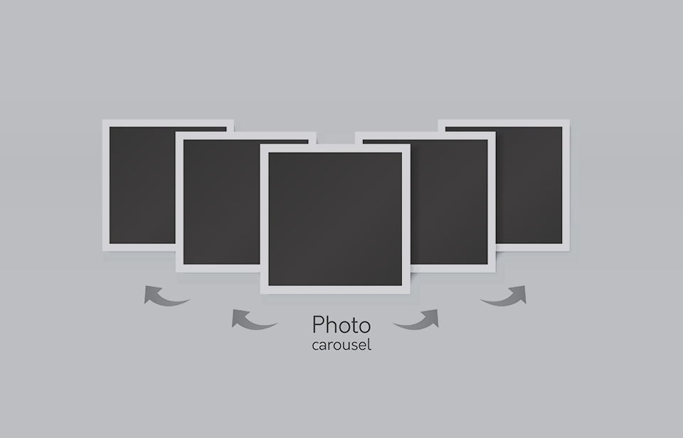
When people are using a design company for their new website, a large number of them request to have an image carousel on their site. Many websites currently have them on their home page where an image appears with text, then slides away to reveal another image with another piece of text. Many websites like to use them so then they are able to draw attention to different areas of their site without having to take up loads of room on the home page.
Despite how effective they appear to be, image carousels are actually not as effective as people think they are. Here we will look at the reasons why image carousels are falsely thought of as very effective additions to websites and what a professional website design company can give you as an alternative.
Why Do People Request Image Carousels In The First Place?
The simple answer to this is that it is a form of animation and people find animation cool. For many website owners that are looking to have this feature installed, it really is as simple as that. They want their website to appear modern and cool so they add some animation in an attempt to make that happen.
It also allows them to give their products or pages on their site equal billing. Instead of one having to get more publicity than the other, they are all kept in one location and they all get the same amount of screen time before the next image appears.
Another big factor in the decision to have an image carousel is the competition. Because image carousels are quite popular, more and more people are seeing them on competing websites, thinking they look cool, and automatically adding them to their site without asking any questions. The problem is, they should be asking questions. Image carousels have not reached the point where their overall impact is minimal at best.
So What’s Wrong With Image Carousels?
The most worrying thing for website owners is that there is not one clear problem with image carousels. There are several issues that they raise:
Resemble Adverts: A large number of website visitors will look at the image carousel and assume that it is just a large banner advertisement. They will ignore it and look around the site themselves, or they will leave because they are put off by the “advert.”
Too Much Choice: It is possible to give visitors to your site too much choice. If you have a lot of pages going around on a carousel, the visitor may feel they can’t handle all the information being thrown at them, so they leave the site.
Visitors Don’t Click: When visitors see the image carousel, they may not instantly think that each image is clickable. They might think it is just some sort of image presentation and then look around the site themselves. This would render the carousel obsolete.
Too Distracting: If visitors have headed to your site to look for something specific, a large image carousel could distract them to such an extent that it distorts the message of your site. Then before they get the chance to have a look at the image and take in what it’s trying to say, it moves along to the next one.
What Can I Use Instead Of An Image Carousel?
Start by thinking about what the goal of your website is. For example, if you’re looking to increase the size of your mailing list, start having relevant links and promotions at the top of the page. If the idea of using images has grown on you, then you can always use hero images that are the width of your background. All you need then is a short piece of written content along with a call to action and you will have an effective hero image. It is static as well, so your visitors will not feel detached trying to process all the images being thrown at them.
If animation is something you really want, then there are alternative options that are more subtle. Perhaps a button that changes color near the call to action or something like that will prove to be more effective than an image carousel.


