McCarthy’s Homevalue
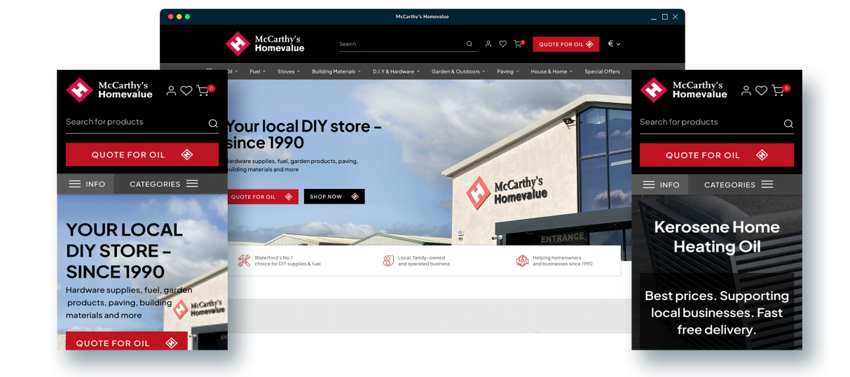
Your one-stop shop for all your home improvement needs!
McCarthy’s Homevalue a great resource for those looking to do some DIY projects around the house. They offer a wide variety of tools and supplies to help with any project. Whether you need a new drill or some screws, a hardware store will have what you need. They often carry a variety of other items such as paint, plumbing supplies, electrical components, and more. McCarthy’s Homevalue is a great place to find all of the supplies you need to get a job done quickly and correctly. With the help of an experienced staff, you can find the right supplies for your project and get the job done right.
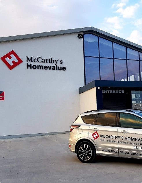

The Task
The website should be modern, user-friendly and visually appealing. The design should be clear, concise and easy to navigate. We should also include engaging visuals such as photos and videos of our services, products and treatments. We should also have an online chat feature where customers can ask skin care-related questions and receive personalized advice. This will help build trust with potential customers and create a more engaging experience. We should also have a section that outlines our mission and values and why customers should choose us. This will help visitors understand our commitment to providing the best skin care services and products. Overall, our website should provide customers with an
informative and enjoyable experience that encourages them to explore our services and products. We should strive to ensure that our website is
well-organized, easy-to-use and engaging.
Increase In conversion rates
Increase in online sales
Increase In repeat customers
Our Solutions
Before getting to work on their new website build and online campaigns, we wanted to work out exactly what they needed to maximise their conversion rates and get more repeat customers. We performed an audit of their website, analysed their target market, and evaluated their competitors to pinpoint areas for improvement.
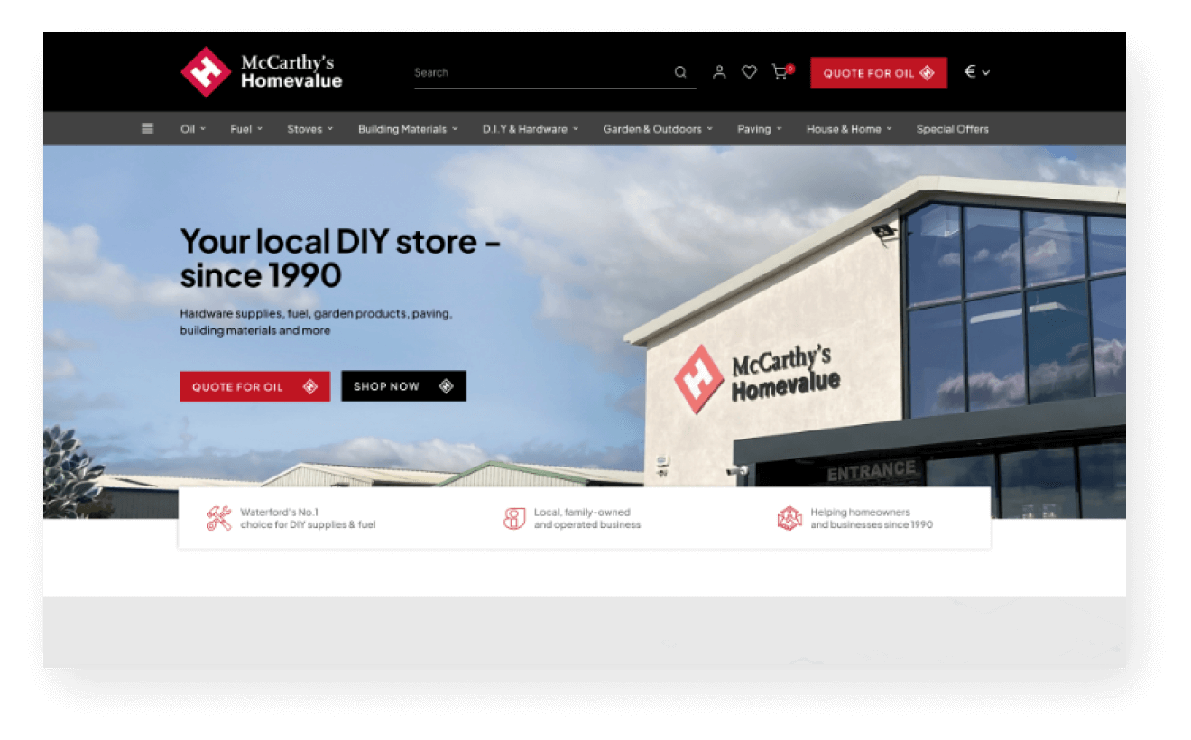
After we had taken care of some technical errors to improve their loading speed, we got to work on our preliminary designs. These designs revealed a fresh, modern look for the site and plenty of features to boost sales. By adding a ‘complete the look’ section, product videos, product suggestions, and an Instagram feed, their website became much more conversion-focused.
It wasn’t just a modernised website they needed to accomplish their objectives. We also crafted multi-channel campaigns to send a large volume of quality traffic to their new website and encourage repeat buys. With enhanced eCommerce tracking installed, we were able to show Foy & Company the great results month-on-month and retarget past customers.
A combination of creative email marketing campaigns, precisely-targeted Facebook and Instagram ads, and attention-grabbing Google Ads all worked in harmony to increase Foy & Company’s sales. We also carried out thorough onsite SEO work to ensure they’d show up on page one of Google for relevant searches.

What We Delivered
- Business Analysis and Strategy
- Brand Refresh
- eCommerce Website Development
- Local and Onsite SEO
- Brand Identity Guidelines
- Website Management Training
- Content Writing
- Website Management Training
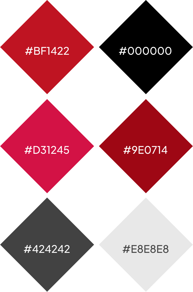
Colours

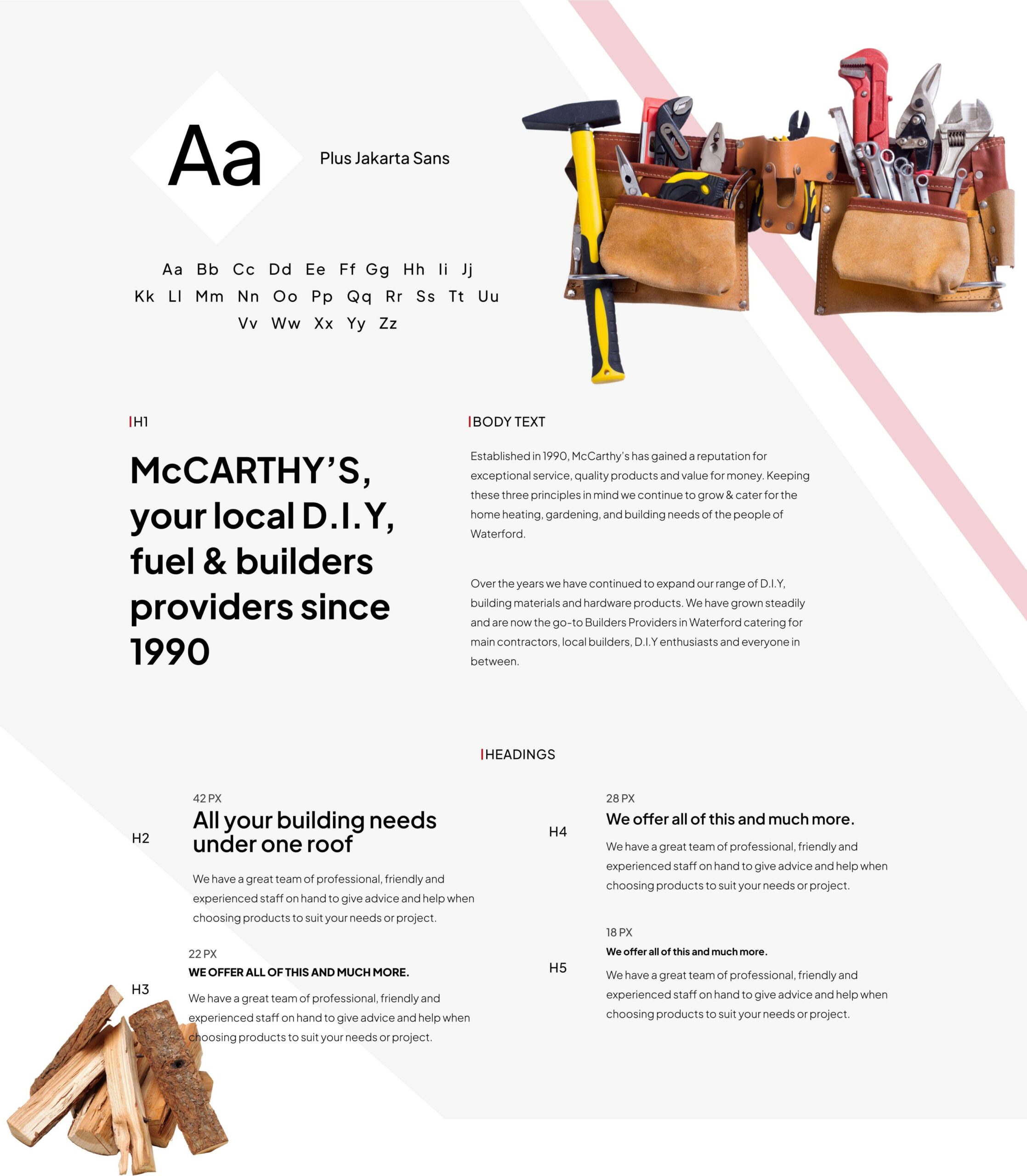
Typography

Iconography
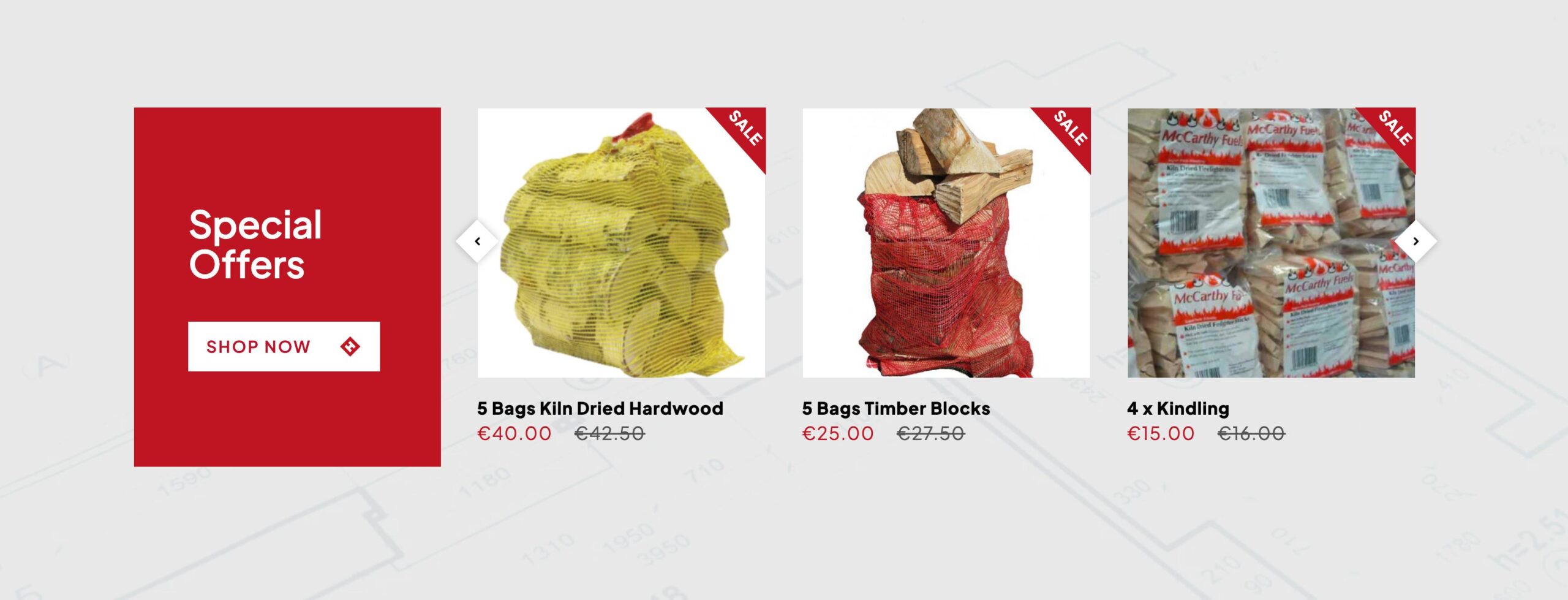
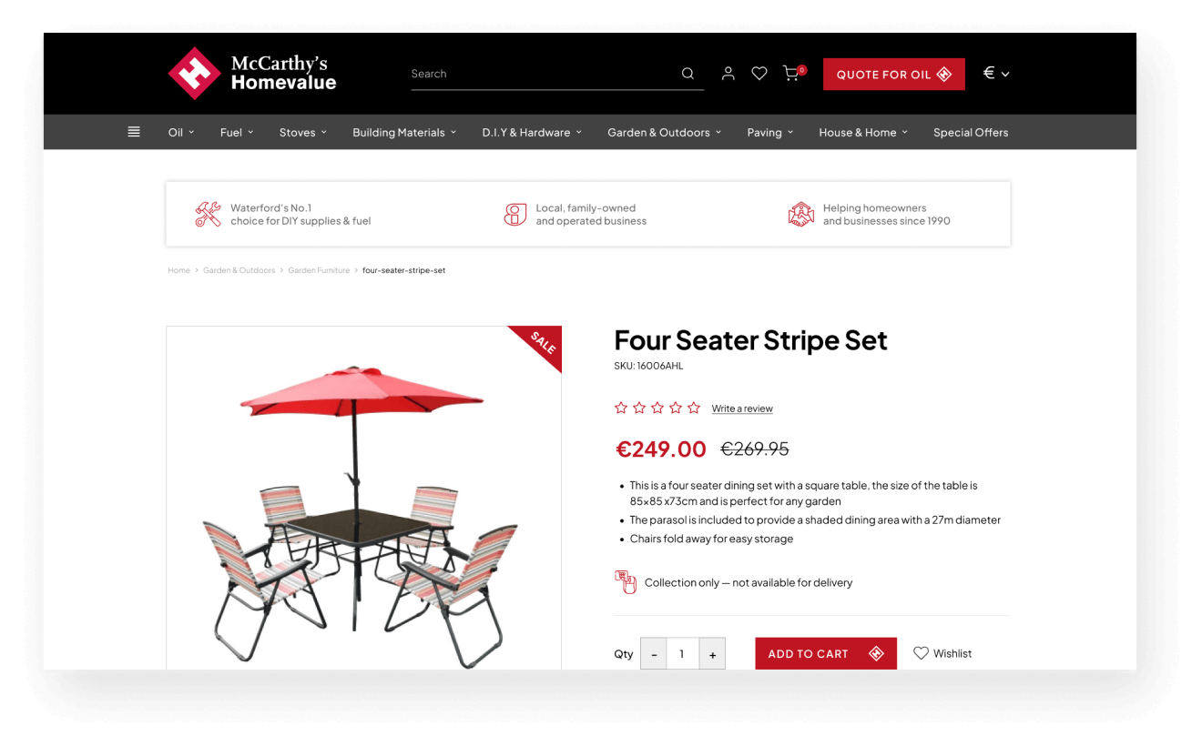
Product Presentation

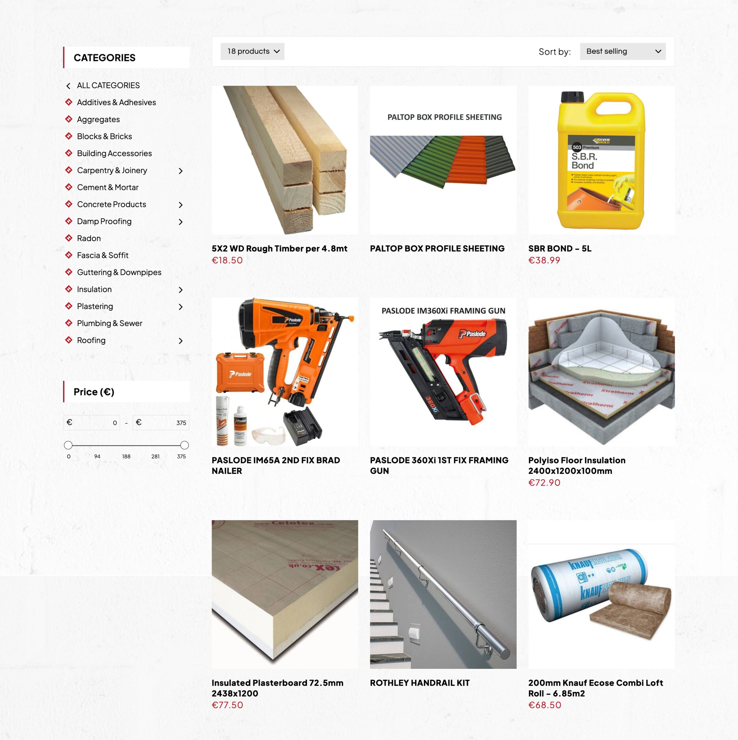
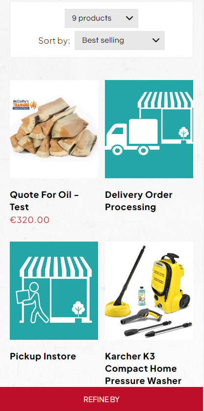
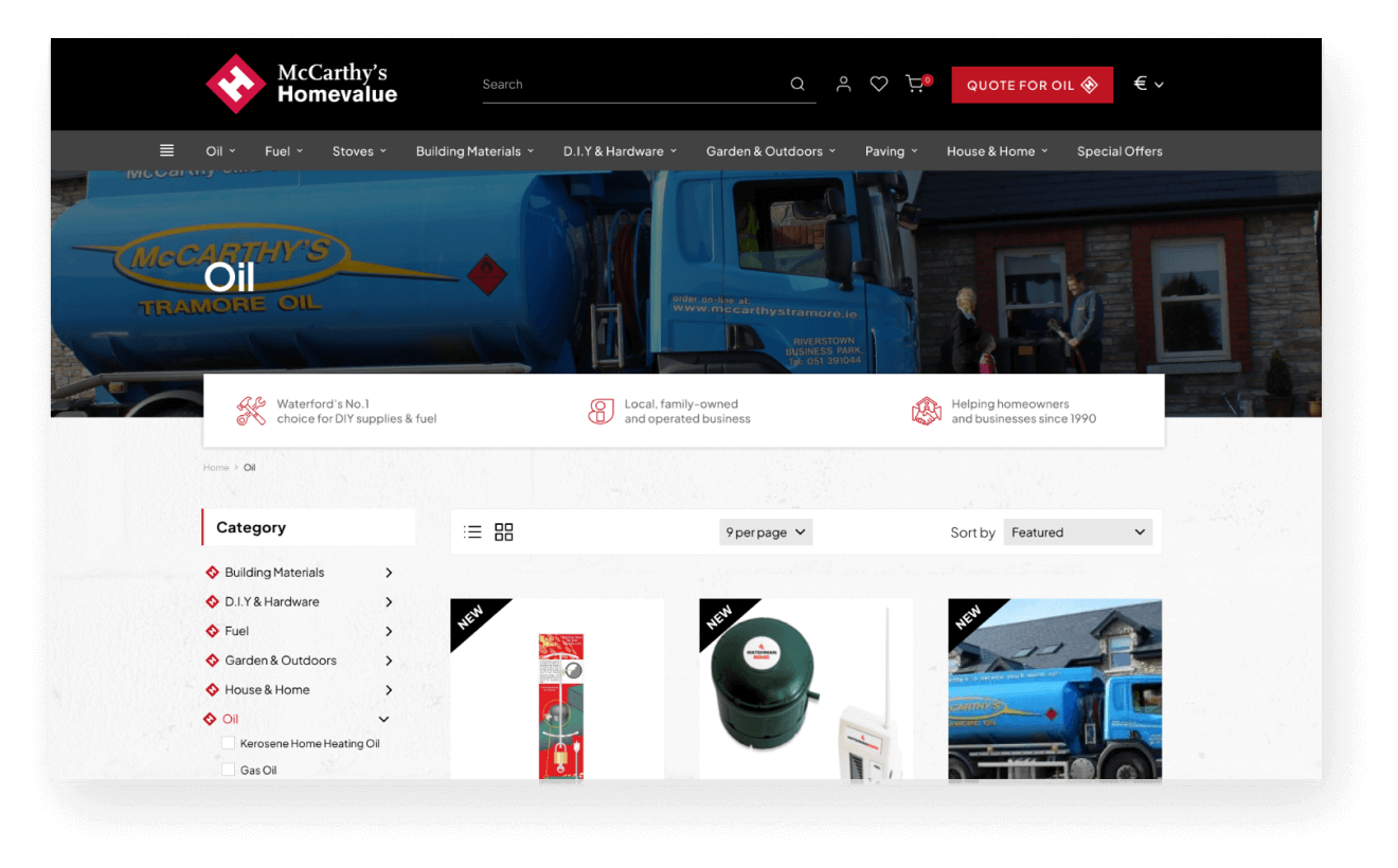
Product Page with Filters
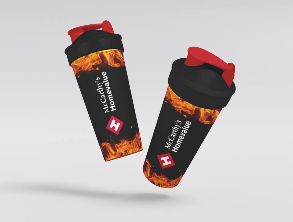
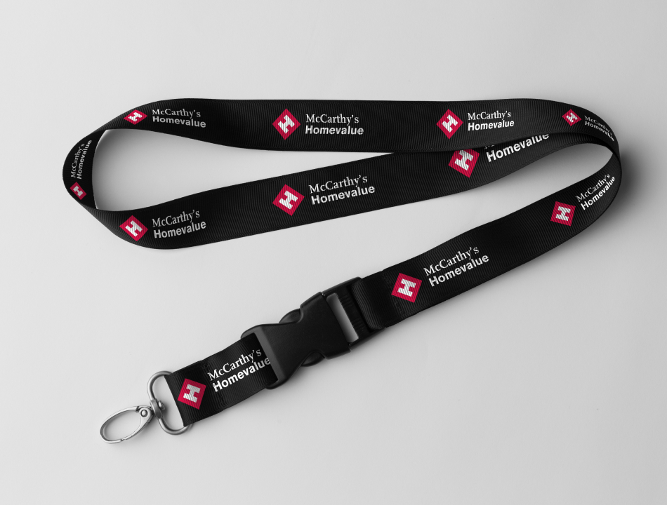
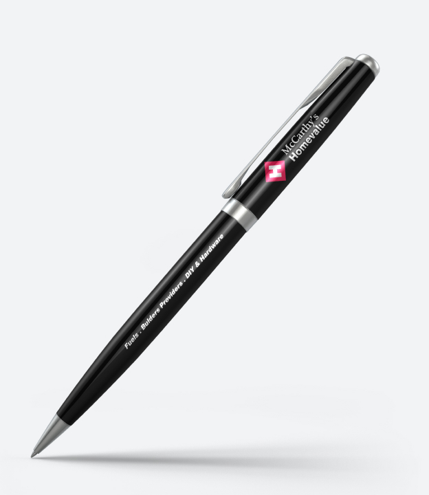
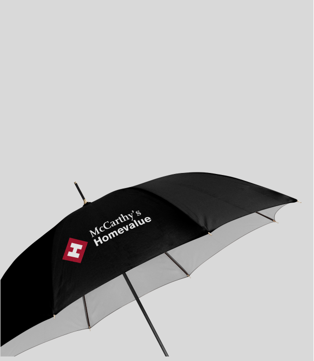
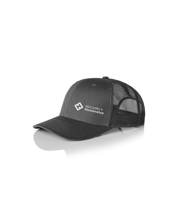
Brandings
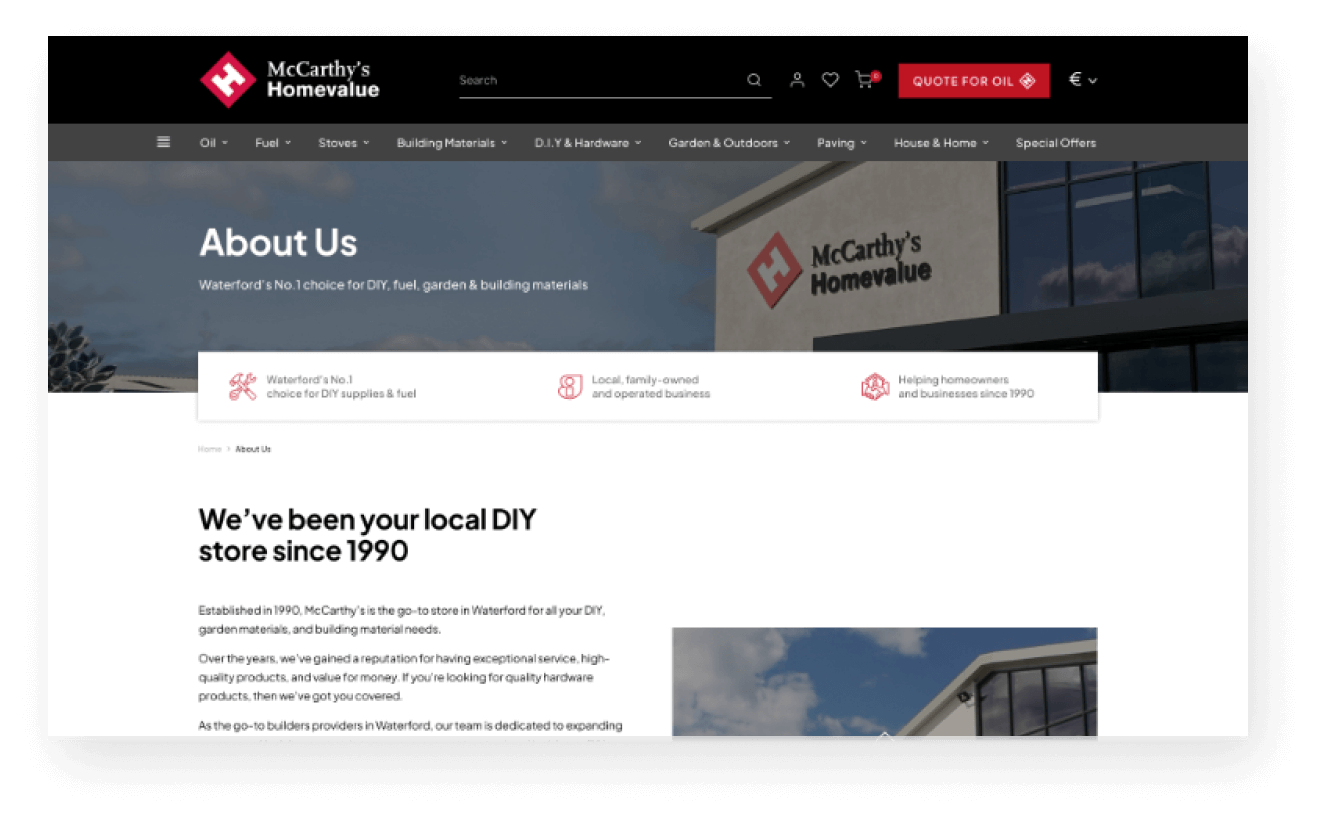
What’s Inside The Pages

What McCarthy’s Had To Say
~ Thomas McCarthy, McCarthy’s Homevalue
Download Full Portfolio
Like what you see? Want to see more? Download our portfolio brochure today!
