This blog examines the pros and cons of having a minimalist or maximalist website design and provides examples for where they work best.
Minimalist
A website design that adheres to a minimalist aesthetic will feature much blank space and encompass sharp and succinct web pages. This pertains to a singular focus as the uncluttered interface shines a spotlight directly on what you are trying to promote, whether it be a product, service, or just your business in general. Yet due to sticking to a clean and economical feel, the design must compromise on content. This can come at the expense of information and therefore while you might have an aesthetically pleasing website design, it may not be an informative website to visit.
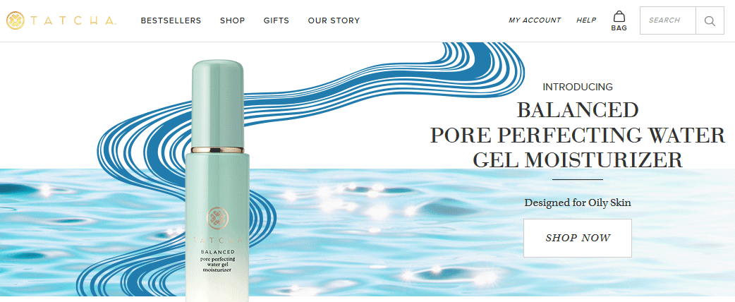
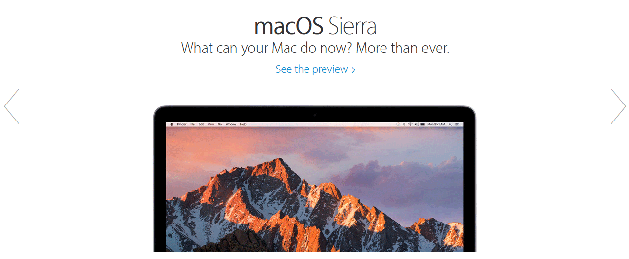 It is easier for more well-established brands and businesses to utilize a minimalist website design. Global companies do not always need to elaborate on their offerings as many people already know about who they are and what they do. The Apple website would be an example of this in that the landing pages can often comprise simply of a product and a tagline or small block of text against a clean white background. Purveyors of luxury goods also favor this design as it gives precedence to their high ticket items without needing to detract from said items with information about their established brand. The Tatcha website as seen below is a great example of this too.
 Maximalist
On the other hand, then we have a maximalist website design. The polar opposite of the above, every inch of space is utilized and filled with a myriad of content such as text, images, and video. The idea here is to empower the website visitor by giving them everything they need (and more). While possibly a good idea, in theory, maximalist website designs suffer by overwhelming their visitors with this scattershot approach. However when done correctly and refined to be accessible rather than off-putting; a well-designed maximalist website can work exceptionally at drawing visitors in and converting them to customers.

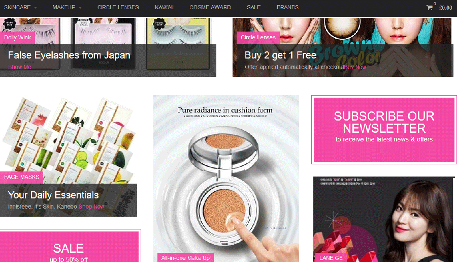
As the name suggests, maximalist website design can work well in situations where extremes are desired and sought after. Extreme sports websites such as dirt-bike riding and monster truck races can suit this style well to convey the adrenaline rush associated with their industry. Maximalist website design is also popular in Japan where many companies make use of the entire webpage space in their layouts and designs. This can range from clothing stores to gadgets and even beauty products. It is quite a jarring approach compared to the majority of European websites which appear very structured, but fascinating all the same to see the cultural differences in website design. Lunatu (pictured below) shows this at play for beauty products.
The expert team at Ireland Website Design can bring to life the perfect website that you have always dreamed of. Every website that we design we optimize before handing it to our clients so that it can drive sales to your business. Get in touch today to have a modern website built that is responsive on both desktop and mobile devices.

